How to get more followers on instagram leaves many brand owners and users completely frustrated. Gaining instagram organic reach has become more and more challenging with 500 million active users and 95 million photos and videos being shared every single day.
Jeesh - those numbers ARE alarming.
But the good news my friend is that YOU can easily make your instafeed stand out.
Imagine you're a magazine editor, you need to make your instagram aesthetic visually pleasing, cohesive and seamless - like every photo compliments the next.
People determine whether to follow an account or not based on the first 9 photos they see in your instagram feed grid. So you really gotta make those photos POP!
Not only does this get you more likes and engagement, but can get you more real instagram followers organically.
I started being intentional with my instagram feed and in 2 months my reach and impressions has increased by 166% (meaning more eyeballs on my content).
When instagram predicts that more users are drawn to your content, it pushes your account into the 'Explore' section, which dramatically increases your chances of gaining more and more followers.
While the tactics of creating a cohesive instagram feed are simple, these guaranteed tips will make your instagram account stand out.

FREE INSTAGRAM CLASS

1) PLAN YOUR CONTENT AHEAD
I know how tempting it is to post your content in real time, but word of the wise, don't (you can use instastories for that).
You need to be completely intentional with the kind of content that you put up on instagram.
It's also essential to diversify your content so that it doesn't become mundane. If you're a product or service based business, it's really easy to fall under the repetition of pushing images of our products or services.
People are NOT drawn to that. Users will follow you on instagram because you offer a story or a lifestyle that's complimented by what you offer.
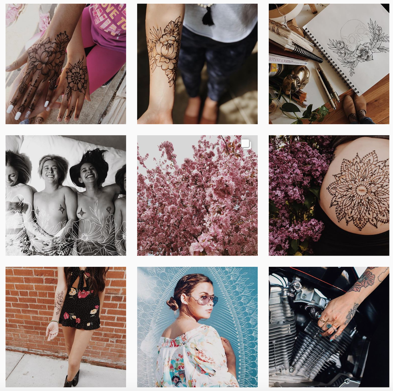
So here are 2 examples:

Wins from this feed:
Includes samples of her own henna work
A complimentary photo of her doodling or "behind the scenes"
Lifestyle shots with her henna work seen
Florals to mix it up while staying on point to her overall theme

Wins from this feed:
A consistent soft colour palette
The cotton candy being seen in different contexts (i.e. on a cupcake, with flowers, etc.)
A quote which compliments her overall theme
A travel shot in Paris
By planning ahead, you'll be able to mix and match your content rather than posting the same old thing.
The good news is there's an array of totally FREE apps that helps you plan your instagram feed ahead of time.

My personal favourite is PLANN which you can download here if you're an iPhone user or here if you're on Android.
The reason it's my instagram planner of choice is because it allows me to click and drag my photos to be able to see my overall aesthetic.

2) DIVERSIFY YOUR CONTENT
We already briefly brushed on that, but mixing up your content makes it all the more engaging.
In the past, I used to sporadically post on instagram and it would usually literally just be an image of a hand with some henna drawn on it and that's that.
It comes off as pushy in a way, that you're trying to shove your work out there as opposed to giving a compelling story on why your content is worth following.
Your focus should be creating a STORY or a LIFESTYLE that your audience craves for.
Instead of posting the same thing over and over, see 3 or 4 degrees of separation that is still relevant and related to your content.
Here are some examples from my own instagram feed for your inspiration:
1. Flat Lays
This can include a snapshot of your work desk, outfit, or possibly even your meal? You can be creative with it :)
2. Include action shots
So this literally can be you in action working, or your product/service being utilized.
3. Add quotes
Trust me, people are suckers for quotes, especially inspirational ones. I usually like to make mine rhyme, but be sure to have a consistent theme for all of them.
You can add quotes that are generic to the people across the board, or even something that's a bit more specific to your niche.
**Bonus Tip: You can add these photos in your instastory highlights and encourage people to download them as wallpapers.
4. Show us photos of yourself
This might seem a bit dreadful, especially if you're a shy type like me. I never feel more awkward than being in front of a camera. But I've found that my most liked and commented photos (and by a landslide) are ones of me.
When you reveal your face, your work becomes much more humanized and relatable.

3) CAPTURE AWESOME PHOTOS
In this digital age, you don't need to be a stellar photographer to capture captivating photos.
You can easily grab gorgeous photos for instagram with your phone!
All you need is some guidance and a little imagination - I'd know, I'm nowhere near being a photographer but have recently been called out on my instagram aesthetic.
So how can you take instagram photos like a pro? Here's a little breakdown...
1. Rule of Thirds
Follow the rule of thirds to create a visually pleasing composition for your photo. You can do so by enabling the grid feature on your iPhone.
On an iPhone, you can enable your camera grid by heading to Settings > Camera > then Turn Grid On.
It's that simple!
Once you turn on that grid, it will be easier to frame your photo in a pleasing composition.
The composition of your photo can either be on the far left or far right, central, or stretching across the entire section (as seen in the examples below).
2. Shoot from different angles
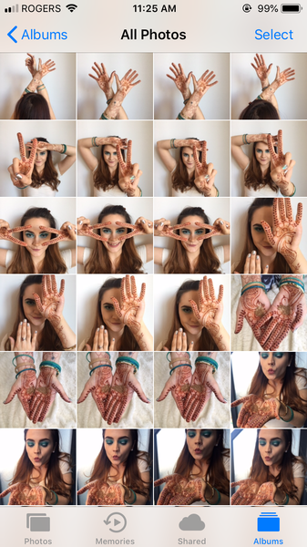
When you shoot the same photo in many different angles, you're giving yourself more variety to choose from.
You'll also realize that some angles are complimentary to some photos but not so much to others. You'll only know if you experiment.
Getting that PERFECT shot will rely on the assortment that you can offer yourself.
So when I take a photo, this is what it looks like on my phone...

When you give yourself more options to work from, it becomes a whole lot easier to get that winning photo that's "instagramable" (hey look, I just invented a new word).
3. Use Props
When you utilize props in your photos, you make it so much more dynamic and less static. That interactive factor can change your photo from ordinary to a lifestyle shot that your intended audience YEARNS FOR!
So here's something to highlight the difference:
WITHOUT PROP WITH PROP

4) EDIT YOUR PHOTOS
Do you know how those influencers get that insta worthy photo? It's by editing the hell out of it!
But a little tip for you, don't over do it and stick with 1 or 2 filters of choice because you want your photos and overall feed to be consistent.
It will take a lot of editing trial and error until you find an editing routine that sticks with you.
Editing your photo can take it from "Just Ok" to "Oh my God, that's AMAZING!"
Editing my photos would usually take me more time than taking the photo itself, and I don't just use one editing app for a photo. I'll use 3 different apps on a single photo.
Here's a one of my popular instagram photos (what it originally looked like, and how it enhanced through editing). Since I used my brother for this shot and I was aiming for a more feminine look, this is what I achieved...
These are the FREE editing apps that I used for this photo:
1. Lightroom
In Lightroom CC, I'm able to control the exposure, brightness, vibrance and temperature of the photo. Having full control over each of those elements really elevates the picture.
You can download Lightroom on iPhone here and on Android here.
2. Facetune
Facetune allows me to conceal elements I don't want seen in the photo (such as those fingertip hairs that my brother struts off lol) or even the paper crinkle in the background.
You can download Facetune on iPhone here and on Android here.
3. Snapseed
I use the focus and lens blur feature in Snapseed. When you focus and defocus elements in your photo, you create so much more depth and it ends up looking much more professional.
You can download Snapseed on iPhone here and on Android here.

5) USE THE SAME GRID & PHOTO SIZE
Having the same photo size through out your feed will make your instagram account much more cohesive.
I personally like to use instagram's square guideline with a width of at least 1080 pixels with an aspect ratio between 1.91:1 and 4:5.
But this rule is not set in stone.
You can use a photo size that best fits your brand or preference.
You'll find different instagram accounts using different photo sizes but make sure to keep it consistent through out their feed.

A fashion inspired account that exclusively uses black borders for its photos.

Just a guy with an aspiration for engineering using rectangular images for his instagram feed.
So you see, you don't have to necessarily fall in the rabbit hole of a standard square sized photo. You can check out this article here that gives the best tips to construct your own instagram size.

6) CREATE A CONSISTENT THEME
One thing all influencers or accounts with massive followings have in common is that they all have a consistent visual theme that they adhere to.
Your theme can be achieved either through your photo editing style, colour palette or photo shots.
My feed style compromises of my brand colours: which are teal and white. This is why I make it a point to include a balance of those selected colours in all my photos.
You'll find that I alternate one heavily teal photo with one white photo so that my overall grid looks like this...
You want people to be instantly able to distinguish that it's YOUR photo!
Here are a few other examples to help you get inspired, from some of my favourite artists:

Amira is a fine artist and she absolutely does her instagram feed a major justice by highlighting a consistent colour palette of purples, pinks, yellows and whites.

Cheyenne is a boudoir photographer and her unique photo taking aims at enhancing beautiful body image (no matter your size). Her photos often includes a play on shadows and a vintage-like or soft editing style.

Sunny is a Youtube BOSS! But other than dominating Youtube, her instagram feed is killer with a lot of white space and brightly exposed photos. It's also obvious that she makes very intentional wardrobe choices to flatter the overall aesthetic.

Mazen is a travel junkie with a go pro camera, but he managed to turn his passion into a full time career. His instagram aesthetic is heavy in blues and turqouise and has an array of travel photo content.
Selecting a theme can be overwhelming, but see what accounts you're drawn to and why. From there, you'll be able to see the elements that you relate to best and make it your own.

7) CURATE, CURATE, CURATE!
You need to curate your content, and by that, you should only post your BEST photos.
Back then, I read that you have to post consistently on instagram in order to get some traction, so I'd go day by day scraping through any photos on my phone just so I can have something to post. But I was wrong to do that.
Because...
You need to be extremely intentional and only post photos that are totally instagram worthy.

Think of yourself as an art gallery owner - would you accept works from artists that were mediocre or would you want to fill your walls with the best artistic pieces out there?
See what I mean?
If you don't LOVE your photo, then don't post it. You must be completely GA GA over it.

8) DON'T PASS OUT ON YOUR CAPTIONS
I'm sure you've heard that a photo is worth a thousand words, but why not actually include the words in there?
Your captions will really up level your photo by creating a background story and make users stop their scroll to read more.
Your captions can dramatically compliment the photo you posted in making it all the more relatable.
I essentially started treating my instagram photos as mini blogs where I make sure to include a captivating description that others can resonate with.
Also, don't shy away from call to actions - by adding a CTA, you're giving direction to the user on what to do next if there's something you're offering.
So here are a few caption examples:
1. Show some vulnerability
When you reveal a bit of your vulnerability, you become so much more relatable. People like to follow content that they can resonate with.
Here's one of my top 5 most liked photos with its corresponding caption...

2. Make it interactive
When you make your captions interactive, you're likely to increase the level of engagement on that photo and Instagram LOVES THAT. The more instagram feels like people are engaging with your content, it tends to push it out on the explore page so you can get discovered.
In one of my photos, I encouraged people to interact by playing 2 truths and a lie and this actually spiralled other users using this same technique in their posts and tagging me for the inspiration.

3. Ask for Comments or Tags
Simply asking people to comment or tag will do the trick. At the risk of sounding bossy, but order filled captions are more inclined to getting responses.
In this photo, I asked people to tag someone they knew is getting married.
There you have it awesome artrepreneur... How to get more likes and followers on instagram will heavily rely on your overall aesthetic and instafeed. Let's recap on how you can create an instagram feed that makes you stand out:
Plan your content ahead of time (don't post in real time, use that for instatory). You can use apps like Plann to help you in organizing your instagram feed.
Diversify your content by creating 3 or 4 degrees of separation of things that relate to one another (you can create: flat lays, action shots, quotes and even self portraits).
Take awesome photos through the rule of thirds, different angles and props.
Edit your photos to really make them pop through free phone apps like Lightroom, Facetune and Snapseed.
Use the same photo size or grid and be sure to have it consistent through out your feed.
Create a consistent theme by either your colour choices, photo editing or angle shots.
Curate your content by being completely intentional with what photos to post. Be sure to only post your best photos and stay away from mediocre ones.
Add killer captions to compliment your photos and create an engaging story to give users something to resonate with.


Comments